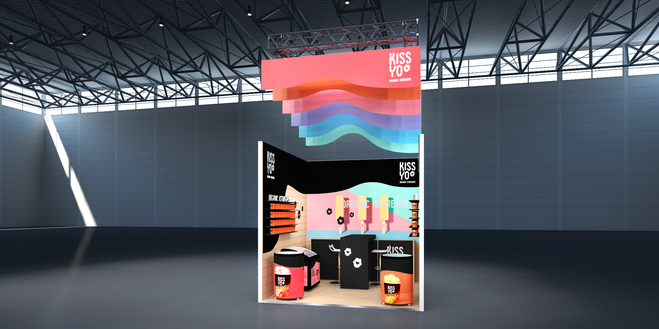
Der Entwurf für KISSYO inszeniert die Bio-Eisprodukte in einer kompakten, aufmerksamkeitsstarken Markenwelt mit integrierten Kühltruhen und gut sichtbaren Produktregalen.
Die farbigen Wellenformen greifen die Leichtigkeit und Vielfalt der Eissorten auf, während der schwarze Hintergrund Verpackungen, Logo und Gestaltungselemente besonders deutlich hervorhebt.
Die Planung ist darauf ausgelegt, bereits aus der Ferne Neugier zu wecken und die Produkte anschließend auf kleiner Fläche unmittelbar erlebbar und probierbar zu machen.
The design for KISSYO presents the organic ice cream products within a compact and eye-catching brand environment featuring integrated freezers and highly visible product displays.
The colourful wave shapes reflect the lightness and variety of the ice cream range, while the black background makes the packaging, logo, and design elements stand out clearly.
The concept appears intended to attract attention from a distance and then make the products immediately accessible and ready for tasting within a small footprint.